Something's not right with Android's UI
I've mentioned previously that I'm really excited about Android. Well, since the launch of the G1 phone, SDK 1.0, and now that its release is due very soon, I've changed my mind somewhat.
My feelings on the essential Android concept remain unchanged: I think it's a brilliant idea. A free, open mobile OS, unburdened by mobile operators' notions of what is appropriate, and with the ability to easily add and replace apps on the fly.
However, the Android concept and the final Android experience are two different things. Playing with the emulator and watching the UI walkthrough have made me uncomfortable. It's mostly a solid, functional UI, with some nice animations thrown in to spice it up a bit; certainly no worse than anything else on the market at the moment that doesn't start with a lowercase i. But I have some usability concerns.
I'm sure it's hard to visually design an OS that's device-agnostic. It has to support touch-screens, qwerty keyboards, standard numbers-and-soft-keys setups; if you believe Andy Rubin's aspirations, it also has to support not only phones but set-top boxes, fridges, car dashboards, and lord knows what else. So I guess that makes it tricky. I certainly wouldn't deny that.
And for the most part it seems like the developers have accommodated these different form factors and input methods admirably. You can almost comfortably only use the touchscreen, or only use the keys. Except for one thing: that bloody menu key.
I happen to own a competing hybrid touch-screen/qwerty phone. Take a look at it:
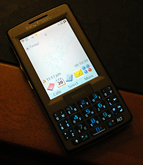
What do you see that Android has completely forgotten?
Full points if you guessed soft keys. Well, not physically, but along the bottom of the screen. Common actions are arranged along the bottom of the screen, in every app, so that for most actions I can do what I need to without ever needing to open a menu or move my finger from the touch screen. If I do need to access the menu, it's there on the right under 'more'. But for the things I do every day, I don't have to look or move away from the screen.
Almost every phone takes this soft-key concept, and it's easy to see why: it makes common actions easier. Popup menus should be avoided because they add an extra action every time you want to do something, but also because they make it hard to know what options are available. On the G1, whenever I want to actually do anything, it'll be: scroll with finger. Select item. Press menu. Select option. Make changes. Press menu. Select save. Is there a pattern emerging here? The joy of using a touch-screen device is quickly going to be lessened by the annoyance of this repeated, unnecessary action.
I imagine it'll be even worse on a traditional numbers-and-soft-keys phone, as finger presses will become repeated direction-pad presses: Menu. Right. Right. OK. Down. Menu. Right. Right...
I'm not sure why this oversight has been made; obviously it's not the end of the world, but give it a few months and new owners of G1s will be making their annoyance known. It's probably also something a firmware update could fix quite easily, without any action on the part of app makers (take the first two menu options, put them on the first two soft keys, add a menu soft key to the right). But it just seems strange to me that Google's plan is for Android to be the standard device OS, whatever that device may be, but they've made touch-screen interfaces a pain, and non-touch-screens even worse.
(Interestingly, the iPhone doesn't use this concept, but it does make actions available on the screen without any involvement from physical buttons.)
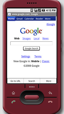
Update: Added a picture below that demonstates what I mean, for clarity. Doesn't that look immediately more useful?