Tutorial: Super-quick shiny button CSS backgrounds
There are plenty of tutorials around on how to create shiny web 2.0 style buttons, but I thought I'd lend my two cents on the method I use. This tutorial details the process I go through to make the CSS background-images for my buttons – and it should only take you a matter of minutes.
The finished product
Creating the image
Open Photoshop and create a new image, making its height match that of your intended buttons, or a little bigger if you like. Width is irrelevant as the image will repeat horizontally. I chose 30px by 30px.
Create a new layer and fill it with a colour. (Select > All and Edit > Fill should do the trick.)
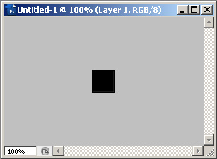
Not much to look at yet.
Creating the gradient
Right click on your layer and choose 'Blending options'. Select 'Gradient Overlay'. This is where all the hard work happens.
Set your angle to -90 – this is just a habit of mine, I like my left-right gradient to correspond to up-down, rather than the reverse.
Double click on the gradient and now it's time to set up that super shiny effect.
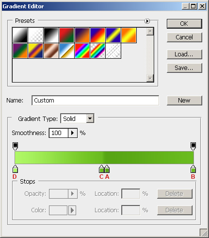
Mm, green.
To break down the process:
A. Start with a dark, saturated colour. Set it at around 51% on the gradient.
B. Make a duplicate at 100% and set it to slightly lighter and less saturated.
C. Make another duplicate at 49% which is slightly lighter again.
D. Finally, set the 0% colour to a much lighter and less saturated copy.
And there you have it! Your finished background-image will look something like this:
Using within CSS
Simply set your required class with:
 background-image: url(path/to/image);

background-position: left center;

background-repeat: repeat-x;
and you're done.
Other resources
For rounded shiny CSS buttons, I recommend Iris Design's tutorial.
To top